WATER ACCOUNTING REPORT
Kenya - 2010 to 2021
Study area
The study area Kenya lies between Longitudes: 33.91 - 41.93 and Latitudes: -4.72 - 5.06. The total area is 585984 Sq.Km. Figure 1 below is an interactive map showing the study area boundary, with labels of major places in the region.
Figure 1 Study area
The elevation in the study area varies between 38 m and 2429 m. Figure 2 shows the distribution of elevation and topography of the study area using the global Digital Elevation Model (DEM) data.The values represent elevation from above sea level. Areas in blue have lower elevation than those in yellow and brown. The major land cover types in the Kenya are Shrubland and Herbaceous vegetation covering an area of 292384 Sq.Km and 92855 Sq.Km respectively.
Figure 3 is a pie chart showing the area distribution of different land cover types in the study area, while Figure 4 shows the spatial distribution of the land cover types in the study area. In these figures, different land cover types are represented by unique colors. For example croplands are shown in light green. Croplands in this map, and also in Figure 3, represent both irrigated and rainfed areas.
Precipitation and Evapotranspiration
Precipitation is the key water source in the hydrological cycle. It refers to all forms of condensation of atmospheric water vapor that falls from clouds. The main forms of precipitation include drizzling, rain, sleet, snow, ice pellets, graupel and hail. In the river basins, where there is no other inflow (e.g. through surface or subsurface flow), the total precipitation accounts for the entire total gross inflow, in the water accounting terms, in any given time period.
For estimating precipitation in the study area,the remote sensing based chirps data is used. Mean annual P over the basin is reported to be 671 mm/year. Figure 5 shows the distribution of P over the study area. P values in this map represent the average annual P for the study period of 2010 - 2021. The daily data were aggregated to annual maps and the average annual P per year for the study area was calculated for the duration of the study. Areas mapped in light blue in Figure 5 receive lower precipitation than the areas in darker shades of blue. The legend provided explains the values different colors represent.
Evapotranspiration is another key component of the hydrological cycle. It refers to the water that is lost to the atmosphere through the vaporization process. Water that becomes evapotranspired is no longer available for further use, hence it is commonly referred to as consumed water in the water accounting terminology. For this report, the long-term average annual ETa values from the wapor product was used to estimate and map ETa in the study area for the selected period. Figure 6 shows the spatial distribution of the average annual ETa. The average annual ETa in the study area is 742 mm/year. The ETa values are mapped in red-yellow-Blue gradient representing lower-mid-high water consumption in the study area. Open water bodies, typically, have the highest ETa values. This is, usually, followed by areas covered by dense forests and irrigated croplands. In contrast, low ET areas are usually dry areas such as deserts, barelands, urban areas and sparsely vegetated areas. Although this could vary from a place to another, based on the specific characteristics of the study area.
Figure 7 shows the spatial distribution of ETa anomaly mean annual precipitation excess or deficit (Right) over the study area. In this figure, ETa anomaly refers to the variation of ETa in 2021 from the long term ETa. ETa anomaly is computed by computing the percentage change in ETa with respect to the long term median. Higher the percentage (> 100), there was positive change in ETa values, lower values represent the decrease in ETa values. The method is explained here.
ETa anomaly is a measure of dryness or wetness. Areas with low values (shown in red) might have experienced drought, depending on the level of variation, and areas with higher values (in blue) have had higher than average water availability, which could be due to increased rainfall or increased irrigation.
Figure 8 shows Precipitation minus Evapotranspiration (P-ET). P-ET is an indicator that is used in hydrology to investigate availability, or lack thereof, of excessive water in an area. Positive values of P-ET is indicative of presence of surplus water. Depending on the terrain and landscape characteristics, this surplus leaves the area through surface runoff, deeperculation, or both. Negative values of P-ET, indicate that ET has exceeded P. This means water consumption has been supported by additional flow of water which could be due to irrigation or the natural process that leads to such an effect (e.g. in flood recessions areas). The figure maps P-ET in light red-yellow-blue gradient representing high-mid-low precipitation deficit in the study area. Areas in red are typically water bodies and irrigated areas, if present. Areas in blue are water generating areas, typically located in high rainfall areas such as highlands. These areas could be of importance for water availability in the basin and in the downstream areas.
Figure 9 shows the spatial distribution of the average annual ETr. The average annual ETr in the study area is 2072 mm/year. The ETr values are mapped in red-yellow-Blue gradient representing lower-mid-high reference evapotranspiration in the study area.
Temporal analysis of Precipitation, ET, and P-ET
In this section temporal variation of ETa, P and P-ETa for the years 2010 - 2021 is analysed. Figure 10 shows the interannual variability of rainfall over the study area. Each bar represents the average precipitation over the study area for the indicated years in mm. The bar graphs are computed using the products - chirps. In a multi year analysis (>6 yr), the years with higher P are those that are typically referred to as wet years and those with the lowest P can be considered dry years.
In addition, two other global precipitation products were processed for the study period (See Table 6 for details). This provides a comparison of the precipitation estimates by different remote sensing based global products. The results of this comparison can be seen in Figure 11. This comparison helps the users to select the precipitation product that shows more agreement with the ground measurements, if available, in the study area.
Figure 12 shows the interannual variability of ETa over the study area. Each bar represents the average ETa over the study area for the indicated years in mm. The bar graphs are computed using the product - wapor. Figure 13 shows the variation in precipitation excess or deficit over the years by plotting the bar graph of annual P-ETa. In this plot, blue represents the precipitation excess and red represents the precipitation deficit. The temporal variation of water use by each land cover type in the study area is plotted in Figure 14. Each year is represented by uniques color in this plot.
Table 1 The total annual precipitation (P), actual evapotranspiration (ETa) & reference ET (ETr) from 2010 - 2021 in the Kenya computed using wapor & chirps
Land cover based Precipitation and ETa analysis
Land cover has an important role in hydrology and in water consumption patterns. Hence, to gain better insight into patterns in water availability and water consumption in the study area, P and ETa data was processed to extract these variables per land cover type. It is computed from annual P and ETa using the time series of spatial maps obtained from multiple sources as listed in Table 6. The long-term average annual ETa values from the wapor product and P values from chirps per land cover type were extracted to compare the water availability and consumption. Figure 15 is a bar plot showing long term annual average ETa and P per Land cover type. Table 2 & 3 list the mean annual P, ETa, P-ETa & ETr for each land cover type in the study area in mm/year and km3/year respectively.
Table 2 The mean annual P, ETa, P-ETa & ETr in mm/year for each land cover class from 2010 - 2021 in the Kenya computed using wapor & chirps
Table 3 The mean annual P, ETa, P-ETa & ETr in km3/year for each land cover class from 2010 - 2021 in the Kenya computed using wapor & chirps
Trend analysis of Precipitation and ETa
The time series of Annual ETa and P give insights into the climatic impact on water availability and scarcity in the study area. To understand the variation of ETa and P over the period from 2010 - 2021, delta ETa and delta P were computed as a residual of long term averages. Delta ETa and P are plotted in Figure 16 & 17 with linear trend line showing increasing or decreasing trends in the anomalies.
Long term annual precipitation for 40 years is plotted for the period 1981 to 2020 to understand the trend. Figure 18 shows the annual precipitation for 40 years with a linear trend line.
Partitioning ETa into Ea and Ta
Evapotranspiration (ETa) is an aggregation of Evaporation (E) and Transpiration (T). E is related to the vaporization of water from wet surfaces (e.g. water bodies, wet soils, wet urban covers, etc.) and T related to the vaporization of water resulting from the process of water movement through a plant and its vaporization from aerial parts, such as leaves, stems and flowers. While E may not be avoidable in the natural landscape, only T contributes to vegetation growth. Hence, in croplands only T is considered as “Beneficial” consumption of water.
Figure 19 & 20 shows the average annual Ea and Ta respectively in the study area. Maps are in red-yellow-Blue gradient representing lower-mid-high E and T in the study area.
Blue and Green ET
The annual actual ETa is divided into green and blue water. Green water represents the fraction of precipitation that infiltrates into the soil and is available to plants; while blue water comprising runoff, groundwater, and stream
base flow.
The average annual ETb and ETg over cropland in the study area is mm/year & mm/year respectively.
In this analysis, green ETa was computed by subtracting the average ETa over Rainfed area from ETa over the cropland. The remaining ETa over cropland were considered as blue ETa. The Rainfed area was computed from the Globcover land cover map. This methodology is explained here.
Figure 21 & 22 shows the spatial distribution of blue and green ETa over cropland. The blue and green ETa are mapped in red-yellow-Blue gradient representing lower-mid-high water use in the study area.
Water Productivity
The biomass production over different land cover types in the study area was estimated using the Total Biomass Production (TBP) data obtained from the Copernicus Global Land service. TBP represents the overall growth rate or dry biomass increase of the vegetation and is directly related to ecosystem Net Primary Productivity (NPP), however with units customized for agro-statistical purposes (kg/ha/day). The 10 days product were downloaded and aggregated at monthly scale.
The WP indicator gives an estimate about the production per unit of water use. In this case seasonal TBP is used representing the overall biomass growth rate. The biomass water productivity was computed using the below formula:
Annual WPb = Annual TBP / Annual ETa
Figure 23 & 24 shows the spatial distribution of TBP & WPb respectively over cropland computed from averaged annual maps for the period - 2010 - 2021. TBP map in Figure 23 uses a dark brown-white-green representing lower-mid-high biomass production in kg/ha. Water productivity is mapped with a red to green gradient, red areas represents lower WPb and green areas represents higher WPb.
The annual mean TBP and WPb over cropland for the period - 2010 - 2021 can be downloaded .
Water Deficit Index (WDI)
Mapping WDI over cropland provide insights about lack of water availability spatially and support investment decisions that aim at improving equity in service delivery across the cropped area. In this analysis the maximum ETa computed from the univariate distribution of ETa over the cropland was used following the formula:
WDI = 1 - (ETa / ETx)
Where ETx is the maximum ETa over cropland. Figure 25 shows the spatial distribution of WDI over the cropland. WDI is mapped with a blue to red gradient, blue areas represents low water deficit and red areas represents higher water deficit regions.
Further long term monthly mean ETa and P from 2010 to 2020 were extracted and plotted (Figure 26) to understand the monthly variation of ETa and P over the study area.
Water Scarcity Indices
Water scarcity refers to a condition of imbalance between freshwater availability and demand where freshwater demand exceeds availability. In this section severity of water scarcity experienced in the croplands of study area is shown using three indices - Blue Water Scarcity (BWS), Green Water Scarcity (GWS) and Economic Water Scarcity (EWS) as explained by Rosa et.al 2020.
Blue water scarcity: When irrigation is unsustainable and renewable blue water availability is insufficient to sustainably meet CWR. In these cases, irrigation impairs environmental flows and depletes freshwater stocks. BWS has been defined as the ratio between societal blue water demand and renewable blue water availability
Green water scarcity: When green water is insufficient to sustain unstressed crop production and irrigation is needed to boost yields. GWS can be defined as the ratio between irrigation water requirement (or “green water deficit”) and the total CWR.
Agricultural economic water scarcity: When there is GWS but no BWS. There is renewable blue water to irrigate but lack of economic or institutional capacity. Agricultural economically water scarce croplands are underperforming rain-fed croplands suitable for sustainable irrigation expansion.
In this report, maps showing number of months in a year cropland area are under BWS, GWS and EWS. Figure 27 shows the spatial distribution of BWS over the cropland. BWS is mapped with a yellow-orange-red gradient, where yellow represents area under BWS for 0 - 4 months in a year, orange represents area under BWS for 4 - 8 months and red areas represents area under BWS for 8 - 12 months. Figure 28 shows the spatial distribution of GWS over the cropland. GWS is mapped with a blue-green gradient, where blue represents area under GWS for 0 - 4 months in a year, lighter blue represents area under GWS for 4 - 8 months and green represents area under GWS for 8 - 12 months. Figure 29 shows the spatial distribution of EWS over the cropland. EWS is mapped with a blue-purple gradient, where blue represents area under EWS for 0 - 4 months in a year, lighter blue represents area under GWS for 4 - 8 months and purple represents area under GWS for 8 - 12 months.
Climate Change future projections (2020 - 2060)
In this section, future trends of annual air temperature and precipitation were analyzed using climate change projection data extracted for the Kenya. The period considered for the trend analysis is 2020 to 2060. Future climate simulation data provided by the Coupled Model Intercomparison Project (CMIP) under World Climate Research Programme (WCRP) is used for the trend analysis. CMIP is developed as a multi-institutional project to better understand past, present and future climate changes arising from natural, unforced variability or in response to changes in radiative forcing in a multi-model context. CMIP6 consists of the “runs” from around 100 distinct climate models being produced across 49 different modelling groups.
For this analysis, data from the Canadian Earth System Model version 5 (CanESM5) model is used. CanESM5 is a global model developed to simulate historical climate change and variability, to make centennial scale projections of future climate, and to produce initialized seasonal and decadal.
Further trends of air temperature and precipitation under two Shared Socio-economic Pathways (SSP’s) scenarios are reported.The SSPs scenarios are complex, incorporating a range from very ambitious mitigation to ongoing growth in emissions. The most ambitious mitigation scenario was specifically designed to align with the low end of the Paris Agreement global temperature goal of holding the increase in global temperature to well below 2°C above pre-industrial levels, and pursuing efforts to limit the increase to 1.5°C.
In this analysis, two scenarios are used:
SSP5-8.5 - Very high GHG (GreenHouse Gas) emissions and CO2 emissions triple by 2075
SSP2-4.5 - where scenario is intermediate GHG emissions and CO2 emissions around current levels until 2050, then falling but not reaching net zero by 2100.
A detailed overview on ssp scenarios are given here.
For Kenya, under SSP5-8.5 trend in air temperature is reported to be increasing with reported slope of 0.05 Degree Celsius (see Figure 30).
Under SSP2-4.5 trend in air temperature is reported to be increasing with reported slope of 0.03 Degree Celsius (see Figure 31).
For Kenya, under SSP5-8.5 trend in precipitation is reported to be no trend with reported slope of -1.92 mm/year (see Figure 32).
Under SSP2-4.5 trend in precipitation is reported to be no trend with reported slope of 0.17 mm/year (see Figure 33).
Trends were computed using Sen’s slope and its significance were tested using Mannkendal tests. A 5 year running mean was applied to the time series.
Water storage variability
Anomaly in water storage change can be studied using data from Gravity Recovery and Climate Experiment (GRACE) twin satellites. GRACE satellites made detailed measurements of Earth's gravity field and improved investigations about Earth's water reservoirs, over land, ice and oceans. In this section, the GRACE data is used to plot water storage changes in cm over the study area from 2002 to 2021.
The dataset used is the gridded monthly global water storage/height anomalies relative to a time-mean, derived from GRACE and GRACE-FO and using the Mascon approach. The water storage/height anomalies are given in equivalent water thickness units (cm). The solution provided here is derived from solving for monthly gravity field variations in terms of geolocated spherical cap mass concentration functions, rather than global spherical harmonic coefficients. Figure 30 shows the change in water storage over the last two decades computed as water storage/height anomalies relative to a time-mean.
Data sources
Open access remote sensing datasets were used to estimate the relevant metrics related to consumptive water use in the study area. For the estimates of water consumption, Precipitation (P) and Actual EvapoTranspiration (ETa) datasets were used at varying spatial resolutions.
The Land cover type information in the study area is computed from the Global landcover map released by Copernicus program of European Union which is available at 100m. The main input to develop this map are the time series of PROBA-V satellite observations. The global landscape is divided into 23 discrete land cover types following the UN-FAO’s Land Cover Classification System (LCCS).
In this analysis, DEM data from the Japan Aerospace Exploration Agency (JAXA) were used to understand the topography of the basin. The ALOS World 3D - 30m (AW3D30) is generated from images collected using the Panchromatic Remote-sensing Instrument for Stereo Mapping (PRISM) aboard the Advanced Land Observing Satellite (ALOS) from 2006 to 2011. The data is open access and free to use for any scientific studies.
Time series of ETa data available from global product - Operational Simplified Surface Energy Balance (SSEBop) at 1 Km spatial resolution was used and made available to the users. SSEBop is developed by applying a simplified surface energy balance model with MODIS sensor data as key input. For Precipitation, three global products were made available for the users to select. The products available are – GPM, CHIRPS and PERSIANN (See Table 4 for details). Table 4 lists the data used in this analysis and its specifications including sources.
ETr data is provided by the United States Geological Survey (USGS) at 1 degree spatial resolution and computed using the Penman-Monteith equation as explained in FAO 56 paper (Allen et al, 1998).
Table 4 Open access data sources used in this analysis
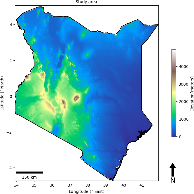
Figure 2 Study area with distribution of elevation
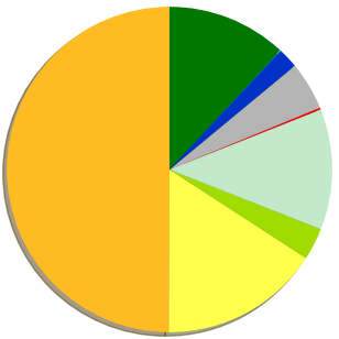
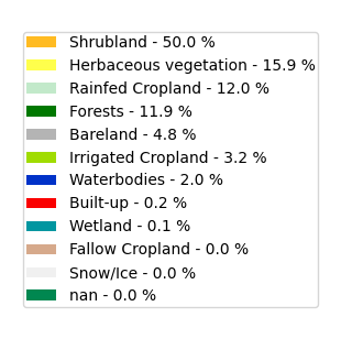
Figure 3 Pie chart showing land cover area distribution
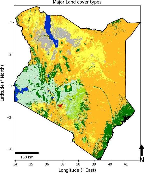
Figure 4 Land cover map (Copernicus) of study area
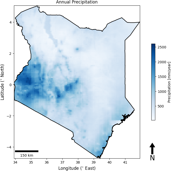
Figure 5 Mean annual PCP map (chirps)
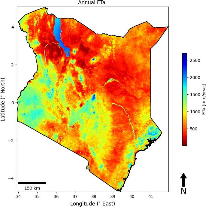
Figure 6 Mean annual ETa map (wapor)
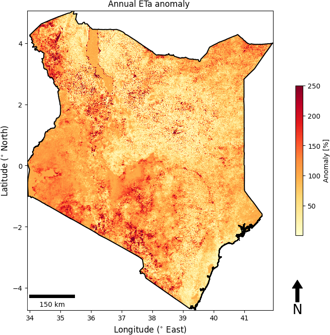
Figure 7 Annual ETa anomaly (wapor)
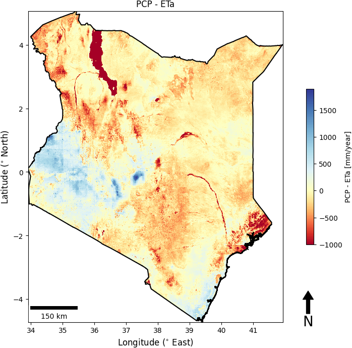
Figure 8 Mean annual P-ETa (chirps-wapor) map over study area
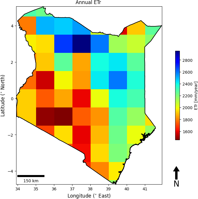
Figure 9 Mean annual ETr over the study area
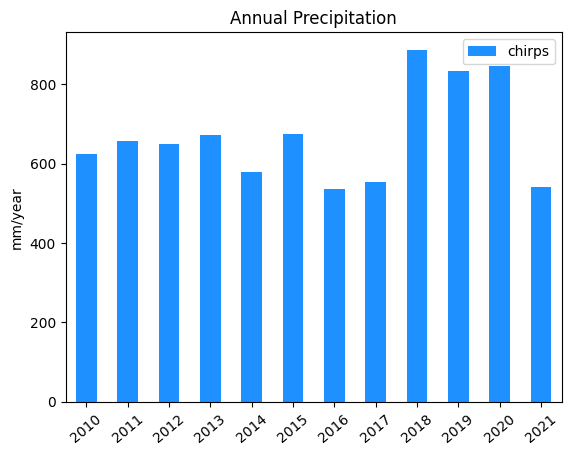
Figure 10 Annual P (chirps) in mm/year over the study area from 2010 to 2021
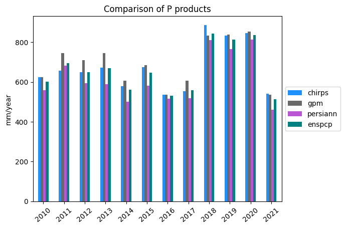
Figure 11 Comparison of Annual P (chirps) from different products from 2010 to 2021
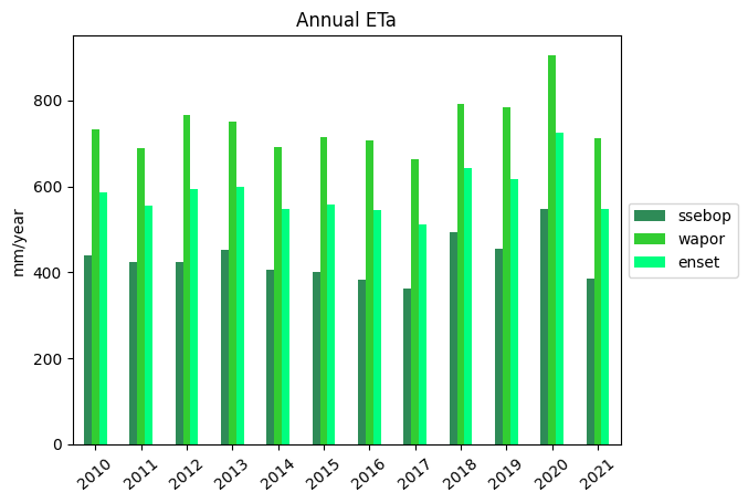
Figure 12 Annual ETa (wapor) in mm/year over the study area from 2010 to 2021
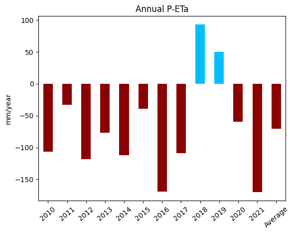
Figure 13 Annual P-ETa (mm/year) over the study area from 2010 to 2021
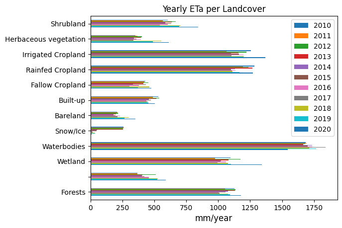
Figure 14 Temporal variation of ETa per land cover type from 2010 - 2020 computed using wapor & chirps
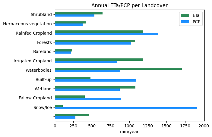
Figure 15 Annual ETa (wapor) and precipitation (chirps) per land cover type
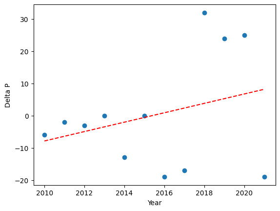
Figure 16 Annual P anomaly
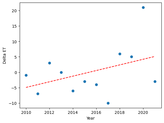
Figure 17 Annual ETa anomaly
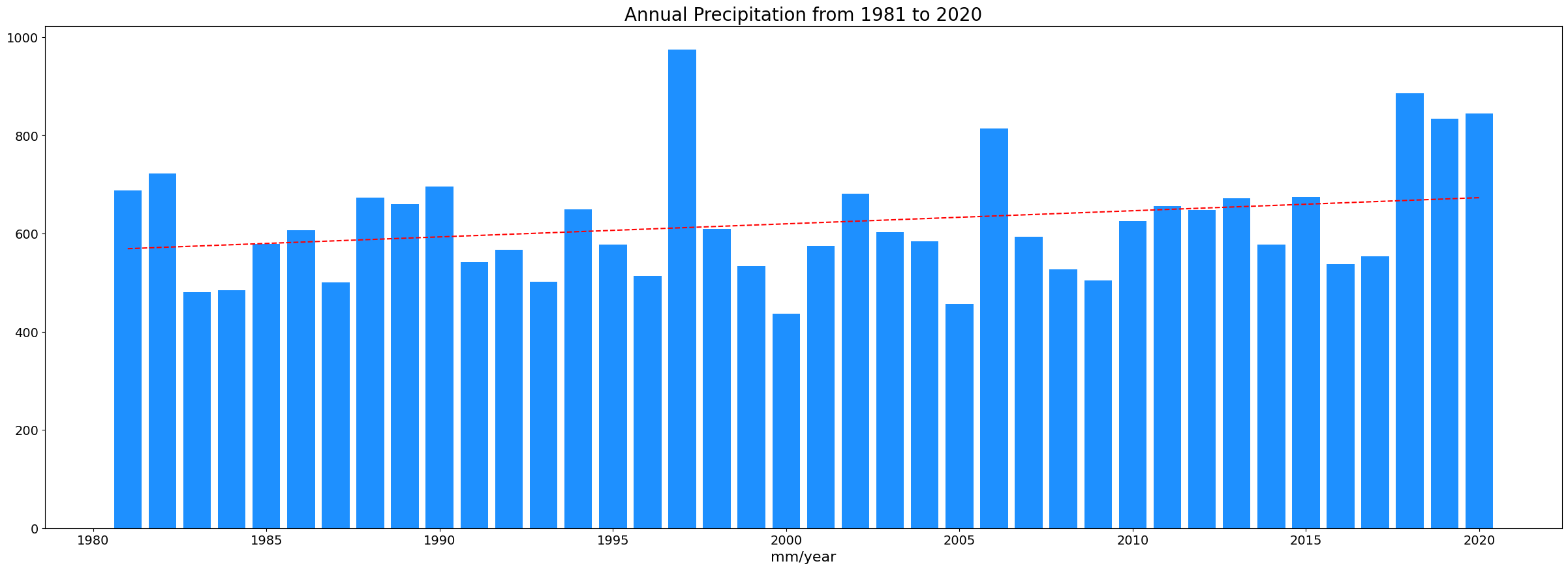
Figure 18 Long term precipitation variation from 1981 to 2020 derived from CHIRPS data
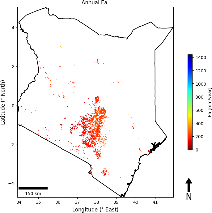
Figure 19 Annual Ea(mm/year) over the studyarea
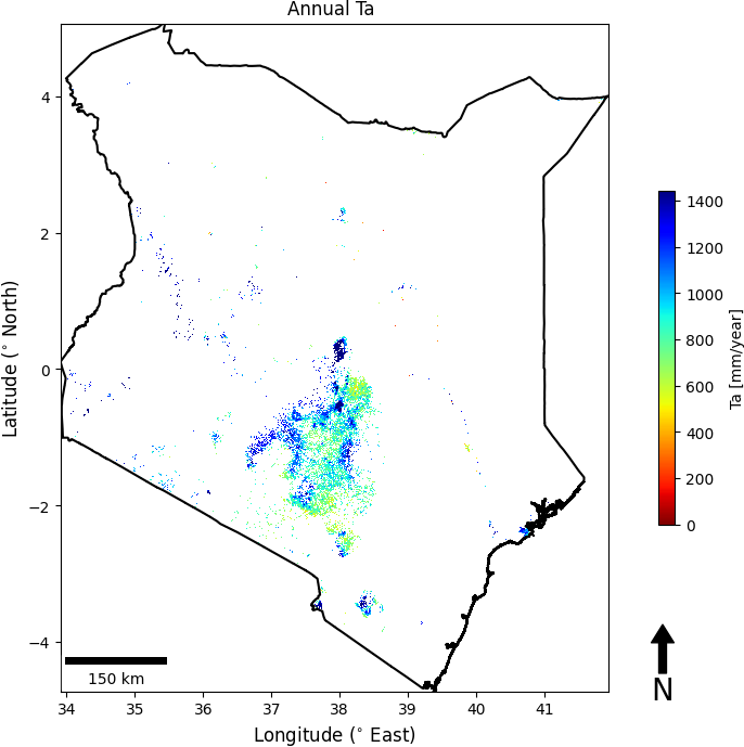
Figure 20 Annual Ta(mm/year) over the studyarea
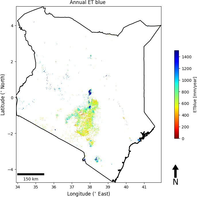
Figure 21 Annual blue ET(mm/year) over the cropland
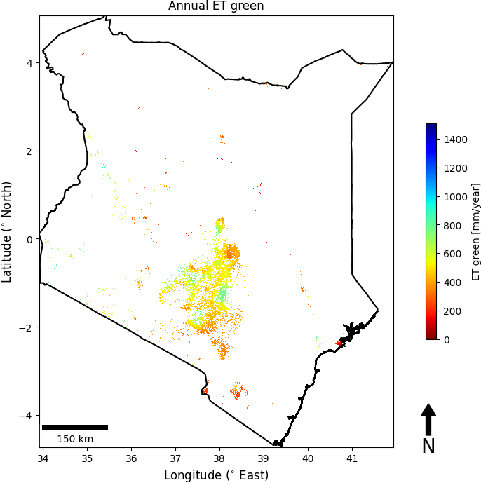
Figure 22 Annual green ET(mm/year) over the cropland

Figure 23 Annual TBP (Kg/ha) over cropland
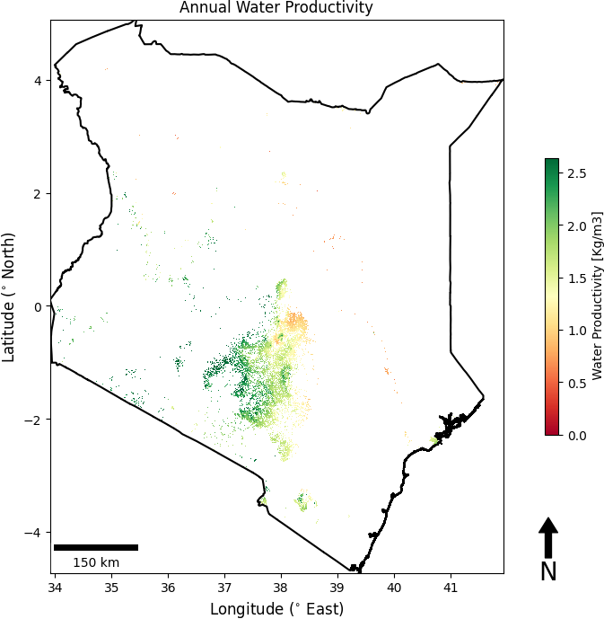
Figure 24 Annual Water Productivity (Kg/m3) map over cropland
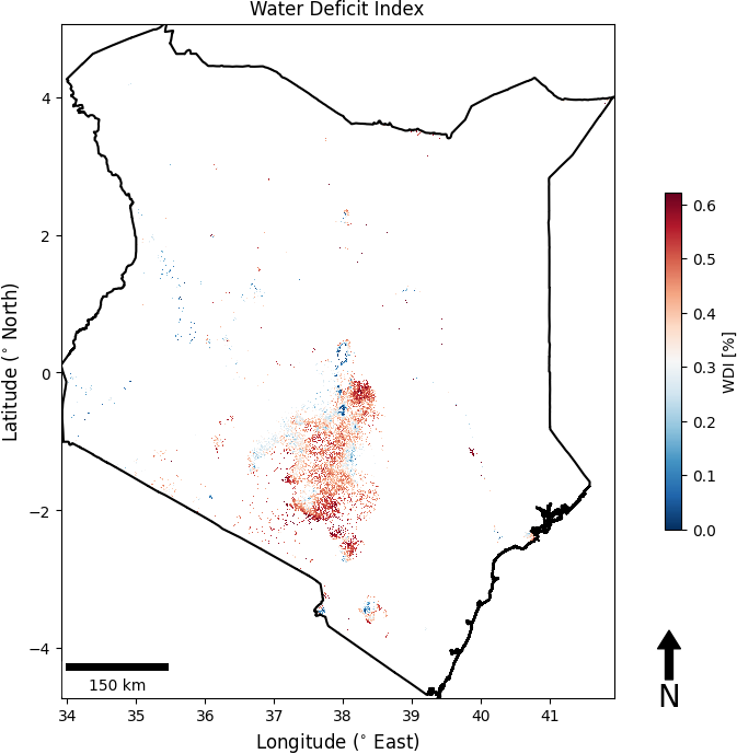
Figure 25 Water Deficit Index (WDI) over cropland in study area
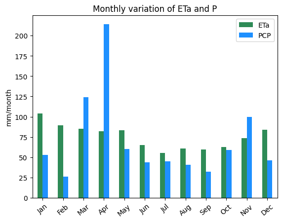
Figure 26 Monthly ETa (wapor) and P (chirps) distribution over the study area
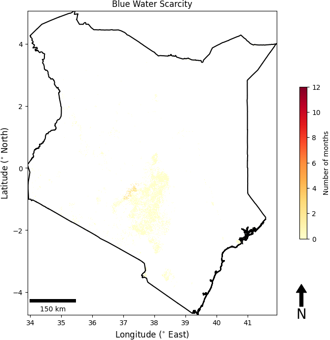
Figure 27 Blue Water Scarcity (BWS) map over cropland
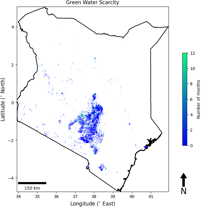
Figure 28 Green Water Scarcity (GWS) map over cropland
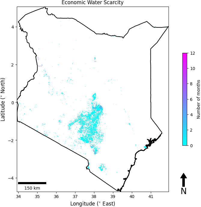
Figure 29 Economic Water Scarcity (EWS) map over cropland
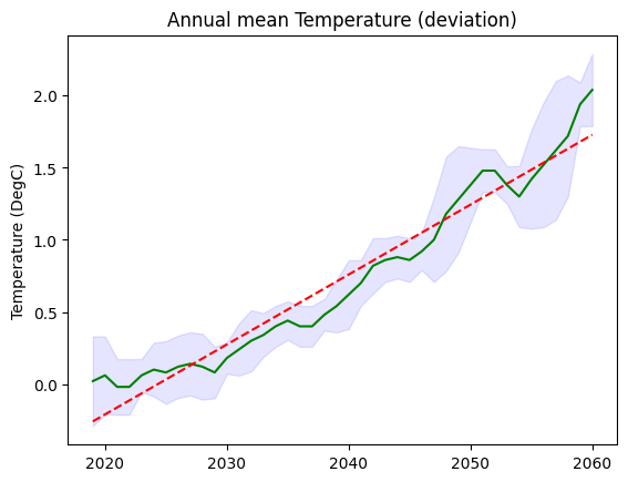
Figure 30 Yearly deviations from 2015-2020 mean for air temperature under SSP-5 8.5
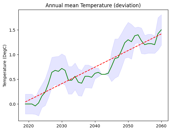
Figure 31 Yearly deviations from 2015-2020 mean for air temperature under SSP-2 4.5
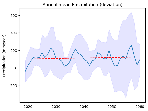
Figure 32 Yearly deviations from 2015-2020 mean for precipitation under SSP-5 8.5
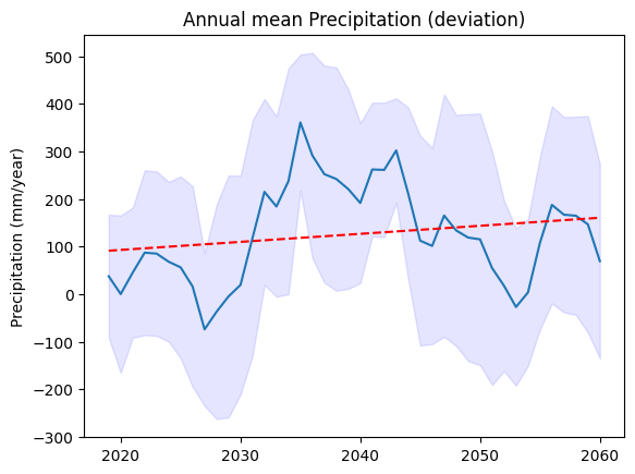
Figure 33 Yearly deviations from 2015-2020 mean for precipitation under SSP-4 2.5
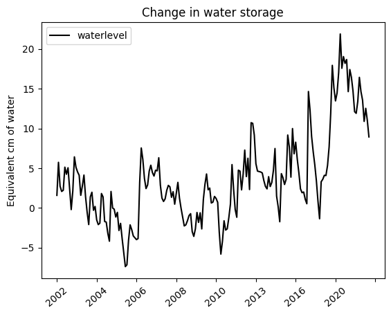
Figure 30 Change in waterstorage (cm) from 2002 to 2021 (Source: GRACE data)